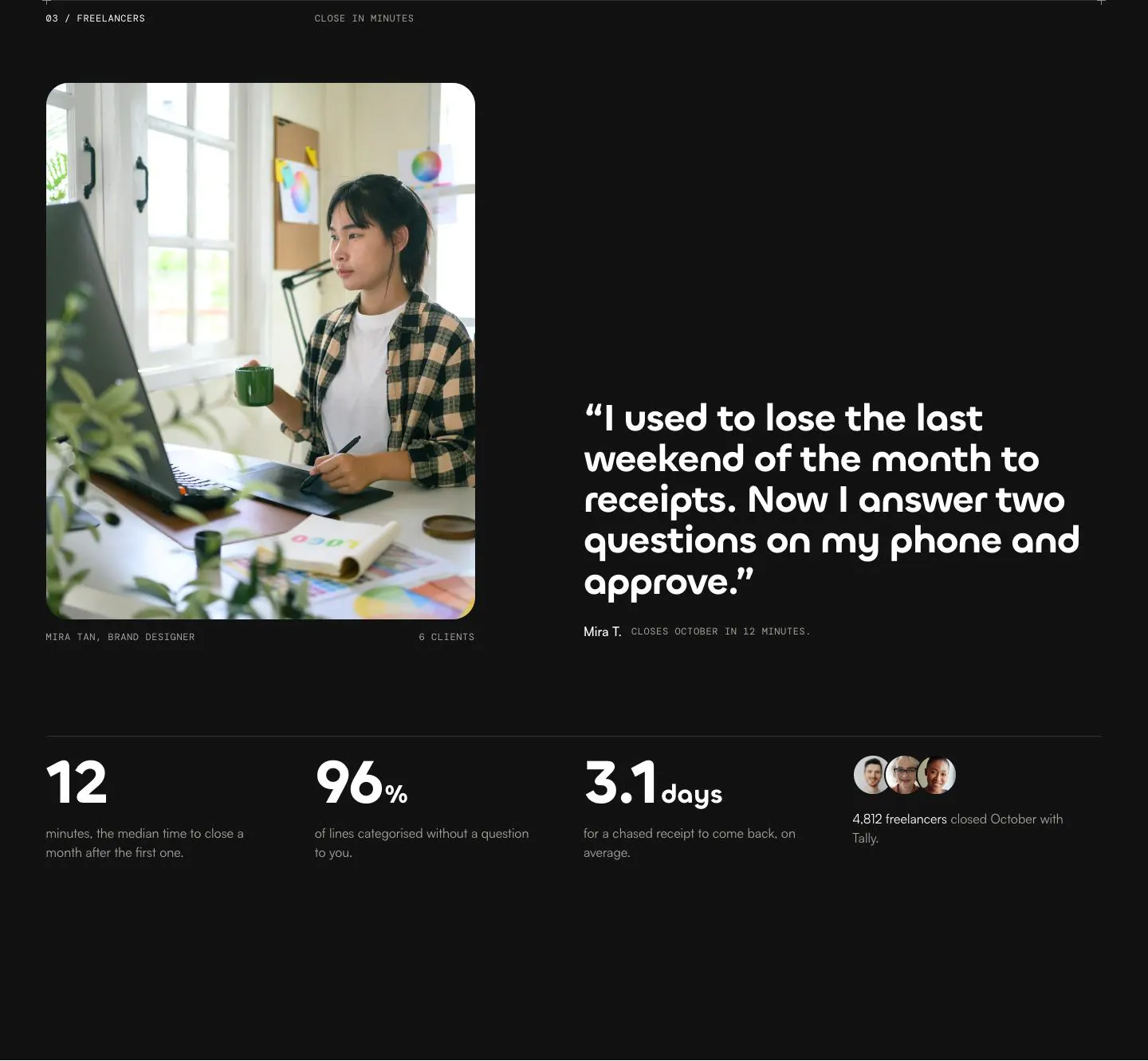
Full screen menu by day
A flat colour full screen menu that opens as a circle from its own button, with numbered links on one side and a photo on the other.
Links in the preview stay on the block.
Open on its ownThe prompt
One prompt, written to stand on its own: goal, structure, type, colour, spacing, behaviour and the words in square brackets to replace. Paste it into any tool that writes HTML. The Code tab has this block as one file.
828 words
# Full screen menu by day

One overlays component, not a whole page: build it to drop into a page that already exists. Works in Claude, v0, Lovable, Bolt, Cursor or any tool that writes HTML.

## Goal
A full screen navigation panel in one flat colour: numbered links on one side, a photo, a call to action and the small print on the other.

## Structure
1. A toggle button outside the panel, 48px round, two bars that cross when open.
2. A div fixed over everything, hidden when closed, scrolling itself.
3. A 12 column inner grid, content held to the top.
4. An ol spanning columns 1 to 8, 1px rules above and between: each link a baseline row, a fixed width index label then the large label.
5. A column spanning 9 to 13: a 4:3 rounded photo with a pill caption at its bottom start corner.
6. Under it a filled pill link with two stacked arrows, then three small lines.

## Type
Large labels Chillax 600, clamp(40px,5.6vw,84px)/1.02, minus .035em. Index labels, caption and small lines DM Mono 400, 12px/1.45, uppercase, .05em, tabular. Pill Satoshi 500, 16px/1. Body Satoshi 400, 18px/1.5. Chillax and Satoshi are on Fontshare, DM Mono on Google Fonts.

## Colour
Panel #FFC93C with #121212 text; index labels, small lines and caption #3F3925; rules #121212 at 16 percent. Photo placeholder #E8B92F, caption pill #FFFFFF. The pill link is #FFFFFF on #121212, moving to #2B2B2B on hover and focus. The toggle is #FFC93C, a 1px #121212 border, #121212 bars, filling #FFD766 on hover. AA: #3F3925 on #FFC93C.

## Spacing and lines
Inner grid 12 columns, gap clamp(14px,1.8vw,24px), container 1440px with clamp(16px,4vw,64px) side padding, top padding clamp(104px,14vh,150px), bottom 40px. Rows at least 56px, block padding clamp(10px,1.6vh,18px), a clamp(14px,2vw,28px) gap between index and label, the index label a fixed 6.2em. Right column 22px gaps: photo 4:3 at a 22px radius, caption 30px tall 12px in from its corner, pill 52px tall. Toggle 48px round, bars 18px by 1.6px.

## Behaviour
Script needed. The toggle flips aria-expanded and unhides the panel, which grows from a clip path circle of 24px at the toggle's centre to one reaching the furthest corner, over .85s, expo in out; from 0.3s the rows and right hand items rise 36px and fade in over .8s, staggered 0.05s. Closing reverses to 24px over .6s, then hides the panel. Open, the page behind is locked with overflow hidden on the document element. Escape closes and refocuses the toggle; Tab loops the toggle and the panel's links; a link closes first, then scrolls to its target. The bars rotate to 45 and minus 45 degrees over .5s cubic-bezier(.7,0,.2,1). The pill's two arrows share one cell, the second at minus 130 percent, both sliding 130 percent over .5s on hover.

## Responsive
At 979px the grid becomes a column with 36px gaps, the right hand column capped at 420px. At 640px the photo is dropped, the index label takes an auto width at a 4.6em minimum, the toggle is 44px.

## Accessibility
The panel is role dialog, aria-modal true, with an aria-label, and stays hidden while closed so nothing inside can be focused. The toggle carries aria-expanded and aria-controls, swapping its aria-label between Open menu and Close menu. Focus moves to the first link about 320ms after opening. The arrows are aria-hidden. Rows are at least 56px tall. Focus ring 2px solid #121212, offset 3px. Reduced motion: the panel appears at full size, the rows do not rise.

## Built values (from code.html)
- Fonts: DM Mono 400, 500 (Google Fonts); Chillax 500, 600, 700 (Fontshare); Satoshi 400, 500, 700 (Fontshare).
- Colour variables: --sun #FFC93C, --sun-2 #FFD766, --sun-t #FFF1C4, --ink #121212, --ink-2 #1B1B1B, --ink-3 #2B2B2B, --white #FFFFFF, --soft #F3F3F1, --muted #5F5F5A, --muted-d #A3A39C, --on-sun #3F3925, --line #E3E3DE, --line-2 #D2D2CC, --line-d rgba(255,255,255,.13).
- Font variables: --display "Chillax",ui-sans-serif,system-ui,sans-serif; --text "Satoshi",ui-sans-serif,system-ui,sans-serif; --mono "DM Mono",ui-monospace,"SFMono-Regular",monospace; --ios -apple-system,"SF Pro Text",system-ui,"Helvetica Neue",Arial,sans-serif.
- Size variables: --pad clamp(16px,4vw,64px), --gap clamp(14px,1.8vw,24px), --sec clamp(120px,14vw,220px).
- Media queries: max-width 979px, max-width 640px.
- Media: assets/studio.webp (1400x933).
- Script: yes, a small inline script.

## Content to replace
- [Menu label]: one word
- [Links]: five, an index label and a title
- [Photo]: 4:3, a workplace
- [Photo caption]: four or five words
- [Button label]: three words
- [Small print]: trial, reassurance, address

## Rules
Plain, specific copy that reads as a live product; never the word sample. No shadows, glow, glass, blur, gradient text, emoji or italics. Motion moves transform and opacity, with colour, border, height and stroke transitions on state changes, and holds its end state under prefers-reduced-motion. Text passes WCAG AA.

## Output
Return the block in one piece: the markup, one style block with the web fonts imported on its first line, and a small script only if the behaviour needs one. No page wrapper, no framework, no build step. Prefix every class with `blk-` and put the colours and sizes in CSS variables at the top.
Media to supply
The photos and video on the live page are licensed for this showcase, so the code points at an assets folder instead. Drop your own files in with these names, or change the paths: studio.webp
More like this
Overlays

Same page